Last updated: June 29, 2026
If you are searching for pastel classroom themes that actually work in a real classroom, you have come to the right place. We are going to walk you through everything you need to create a soft, welcoming space your students will love from day one. From color palettes to accent pieces, the ideas here are practical, affordable, and genuinely beautiful.
Choosing Your Pastel Color Palette
The most important decision in any pastel classroom theme is the anchor color. This is the hue that appears most frequently and ties everything together. Popular anchor colors include dusty rose, soft mint, sky blue, and butter yellow.
Once you have your anchor, choose one or two complementary accent shades. A sage green anchor pairs beautifully with warm cream and a touch of terracotta. A lavender anchor works well with blush pink and soft white accents.
Avoid using more than three colors in your palette. The charm of pastel classroom themes is their simplicity, and too many competing shades can make the room feel scattered rather than serene.
Neutral backgrounds are your best friend here. White shiplap bulletin board paper, natural wood tones, and wicker baskets all allow your pastel colors to stand out without competing. When in doubt, go neutral on large surfaces and bring in color through smaller accents and paper goods.
Pastel Classroom Themes by Color Family
Blush Pink and Cream
This combination is one of the most popular pastel classroom themes for a reason. It feels warm, gentle, and endlessly versatile across grade levels.
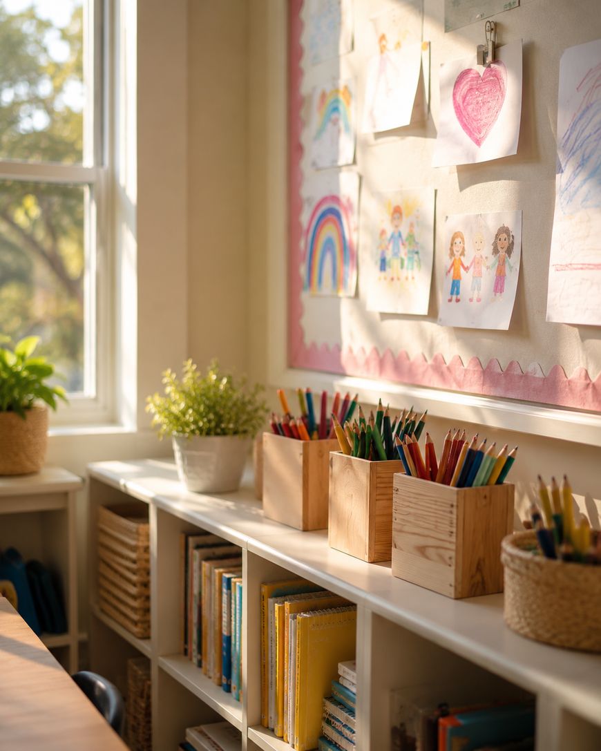
Pair blush bulletin board borders with cream or white backgrounds and bring in natural wood elements like pencil holders, small shelves, and supply bins. Dried pampas grass or artificial floral stems in a simple vase add texture without clutter.
Add soft pink labels to your student supply bins and use white cardstock for any anchor charts or word walls. The result is a space that feels curated and cozy without looking overdone.
Sage Green and Natural Wood
Sage green has become a staple in modern pastel classroom themes, and it works especially well when paired with natural materials. Think rattan baskets, wooden clip frames, and burlap accents.
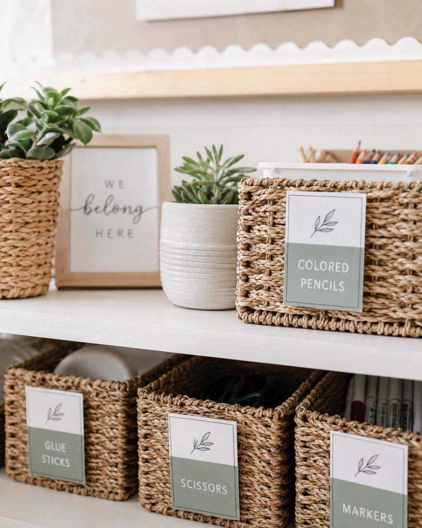
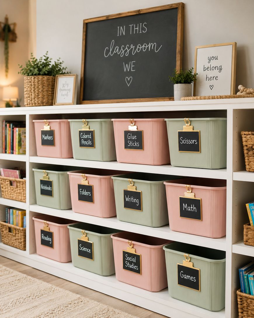
Use sage green as your primary color on bulletin boards and storage labels, and let the wood tones do the heavy lifting as your neutral. Plants, both real and faux, look stunning in this palette and reinforce the earthy, grounded feel.
This theme translates easily across science, literacy, and math spaces. It never feels too gender-coded or too babyish, which makes it a strong choice for upper elementary classrooms.
Lavender and Soft Yellow
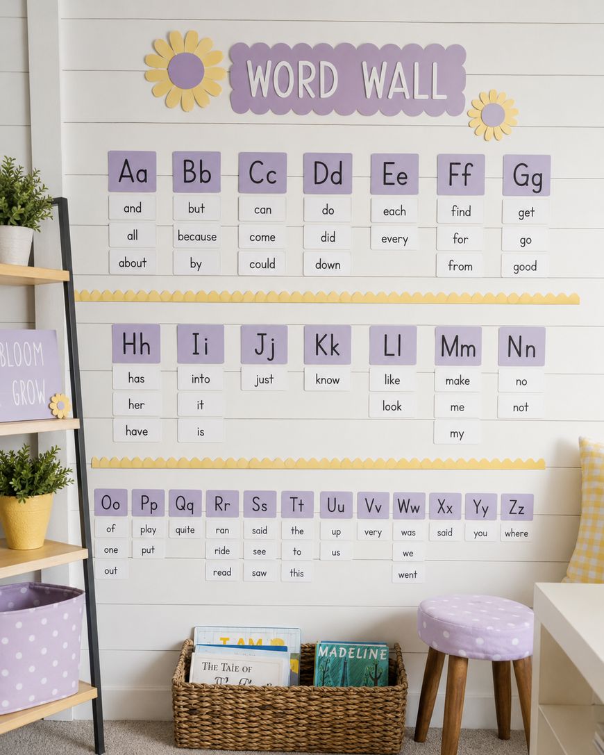
Lavender paired with a gentle butter yellow creates one of the most cheerful pastel classroom themes without veering into primary-color territory. It feels playful and sophisticated at the same time.
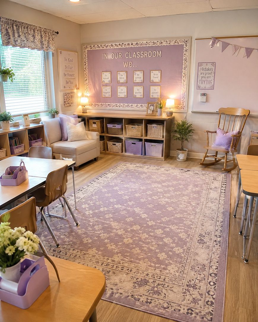
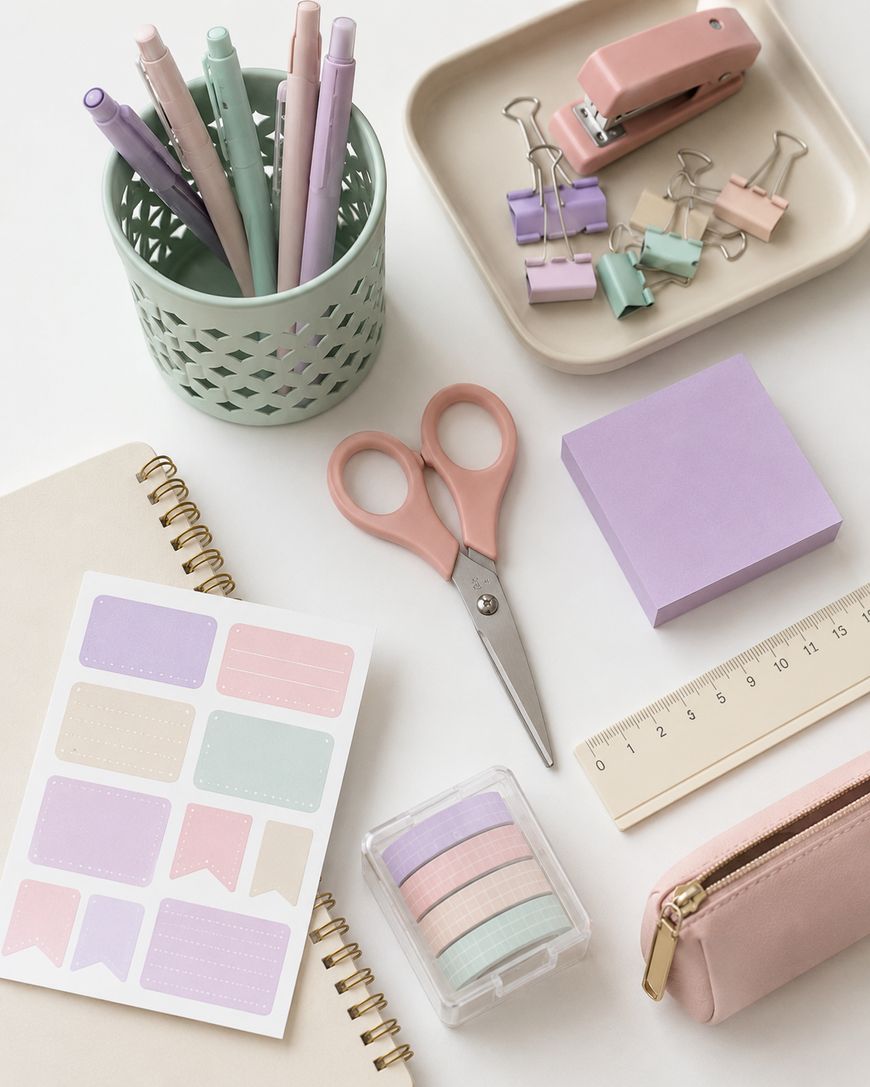
Use lavender as your primary paper and border color, and bring in yellow through small accents like pencil cups, drawer pulls, and sticky note displays. This palette works beautifully with white furniture and light-colored shelving.
It is also a great choice for kindergarten and first grade classrooms where you want warmth and energy while still maintaining that calm, inviting atmosphere.
Sky Blue and White
Sky blue is one of the most timeless of all pastel classroom themes. It reads as clean, calm, and universally welcoming across all ages and subjects.
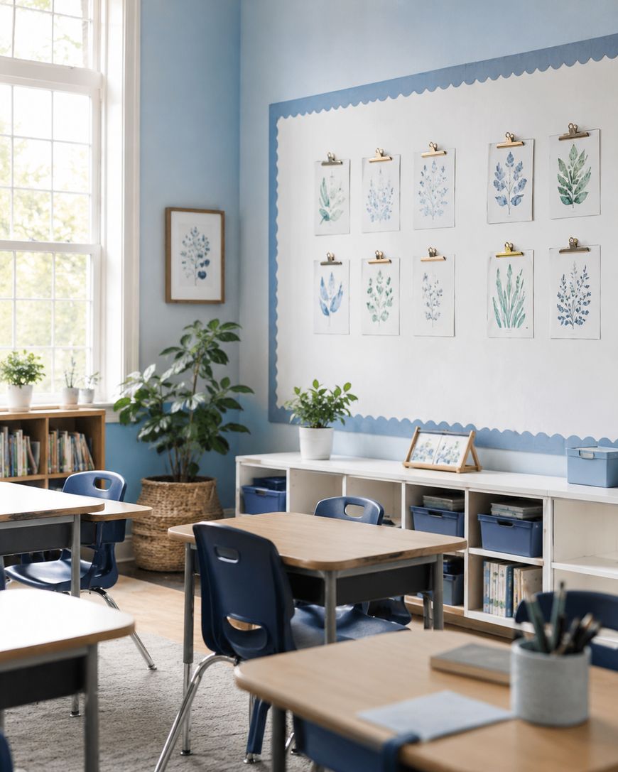
Pair sky blue with bright white for a crisp, airy feel. Add gold or brass accents through staple holders, frames, and hooks to give the space a polished, elevated look.
This palette works especially well in reading corners and library spaces. It creates the kind of atmosphere that signals to students that this is a place for focus and imagination.
Decor Elements That Elevate Pastel Classroom Themes
Bulletin Boards and Borders
Your bulletin boards are the largest decorative surface in your classroom, so getting them right is essential. Choose background paper in your lightest neutral, typically white or cream, and frame boards with a border in your anchor pastel color.
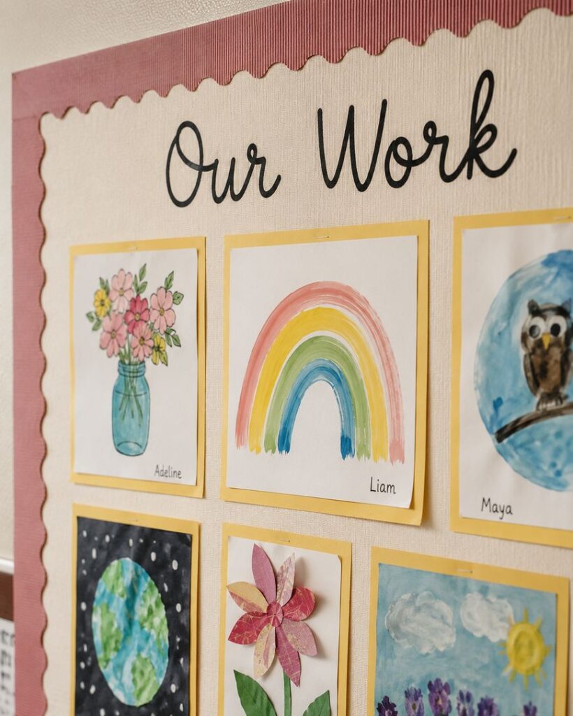
Keep board displays simple and intentional. A student work display surrounded by a blush border and a single text header in clean font will always look more polished than a board overloaded with clip art and multiple color borders.
Storage and Organization
Storage is where pastel classroom themes can really shine. Coordinated bins, baskets, and labels pulled from your color palette make even a crowded supply shelf look beautiful.
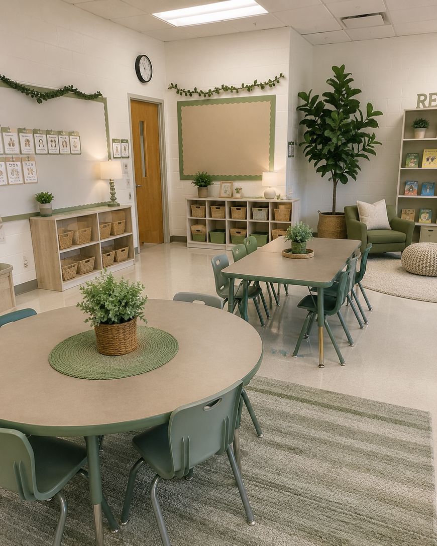
Wicker baskets in natural tones work with almost every pastel palette. Add custom labels in your accent color and a clean, readable font. Students are more likely to keep supplies organized when the systems are visually clear and aesthetically pleasing.
Rugs and Soft Furnishings
A soft area rug in a neutral tone or gentle pattern anchors your reading corner or group meeting area. Look for rugs with simple geometric designs or soft stripes in colors that complement your palette.
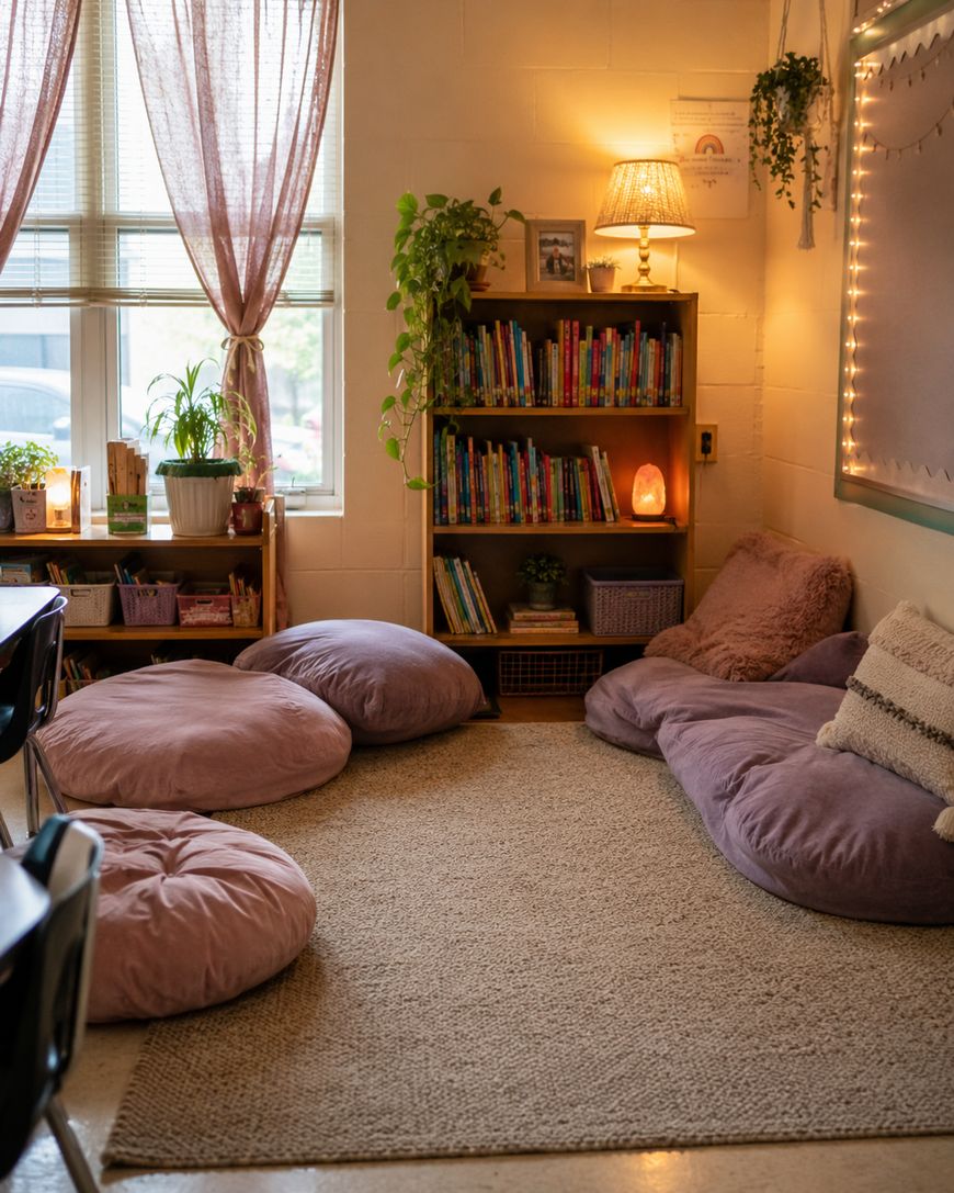
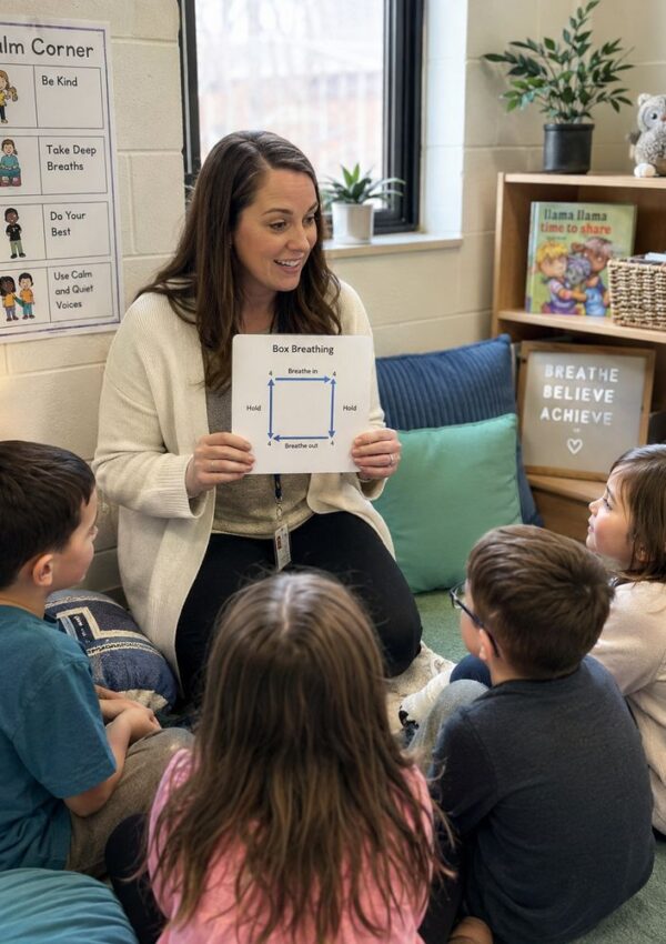
Bean bags, floor cushions, and soft seating in coordinating pastel tones add comfort and warmth. These elements signal to students that the classroom is a safe, welcoming place for learning.
Lighting
Overhead fluorescent lighting can wash out even the most thoughtfully designed pastel classroom themes. Wherever possible, add warm supplemental lighting through plug-in lamps, string lights, or light strips behind shelving.
Warm white bulbs in a simple lamp near your reading corner instantly change the feel of the space. Even one or two lamps can make a fluorescent-lit classroom feel genuinely cozy and inviting.
Budget-Friendly Ways to Build Your Pastel Classroom Theme
You do not need to spend a fortune to create a beautiful pastel classroom. The key is to start with your most visible surfaces and work from there.
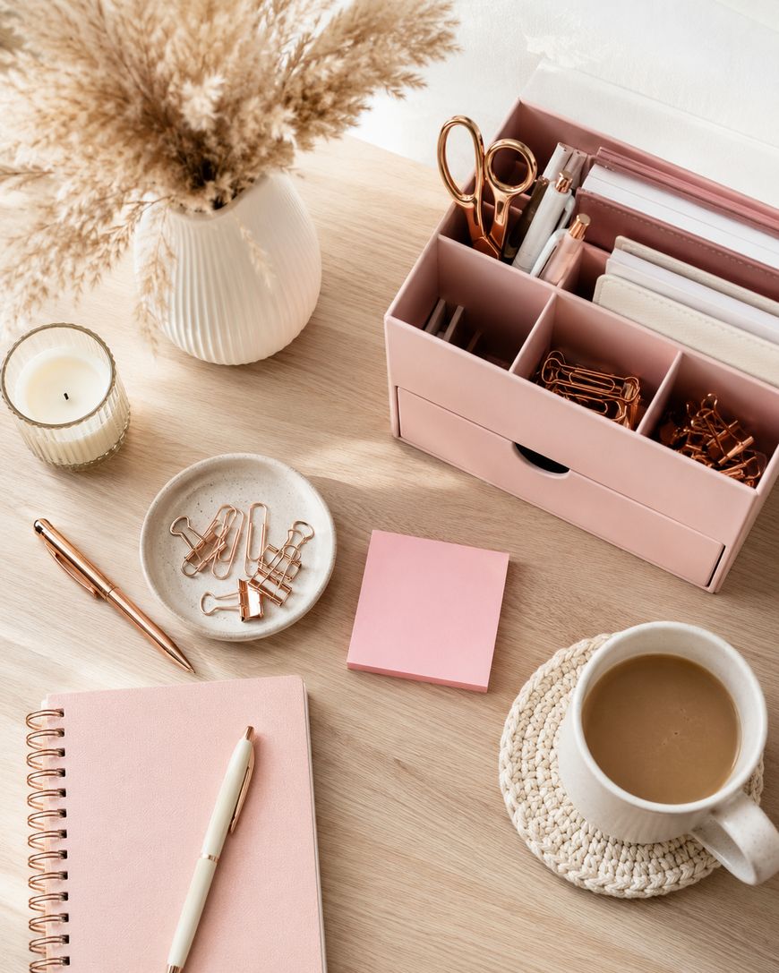
Bulletin board paper and borders are your highest-impact, lowest-cost investment. A fresh set of coordinated borders and a clean background paper can transform a board in under an hour for just a few dollars.
Dollar stores, thrift shops, and garage sales are goldmines for pastel decor. Spray paint in your chosen colors can transform mismatched bins and baskets into a cohesive set in a single afternoon.
Printable decor packs from teacher marketplaces like Teachers Pay Teachers are another affordable way to get coordinated labels, headers, and accent pieces without crafting everything from scratch. Many pastel classroom themes packs include editable files so you can customize names and subjects to match your exact needs.
Setting Up Your Pastel Classroom: Where to Start
Walk into your empty classroom and identify the three zones that students will see first: the front board area, the entry wall, and the main reading or gathering space. These are your priority zones.
Start by covering bulletin boards in your neutral background paper and adding your pastel borders. Then move to storage organization, labeling bins and shelving in your accent color.
Save small accent pieces for last. Once the large surfaces are handled, you will have a clearer sense of where you need additional warmth and where the space can breathe.
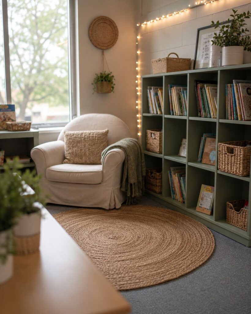
Why Pastel Classroom Themes Work So Well
There is real research behind the calming effect of soft color palettes in learning environments. Pastel tones like blush pink, sage green, lavender, and warm peach reduce visual stress and help students feel settled and ready to focus.
Unlike bright, saturated classroom decor, pastel shades create a sense of warmth without overwhelming the senses. Teachers who have made the switch often notice that students are calmer during transitions and more engaged during instruction time.
Pastel classroom themes also photograph beautifully, which means your space will look incredible in back-to-school photos and open house nights. That is a small bonus that goes a long way when parents walk through the door for the first time.
Beyond aesthetics, a cohesive pastel palette makes your classroom feel intentionally designed. Students pick up on that care, and it signals to them that their environment matters, which makes them more likely to respect and take pride in the space.
Frequently Asked Questions About Pastel Classroom Themes
What grade levels work best with pastel classroom themes?
Pastel classroom themes work across all grade levels, from preschool through middle school. The key is adjusting the sophistication of your decor elements. Younger grades do well with playful fonts and whimsical accents, while upper elementary and middle school spaces look best with cleaner lines and more minimal styling.
How do I get my classroom to look cohesive without spending a lot of money?
The fastest way to create cohesion is to commit to a three-color palette and stick to it. Even mismatched items look more intentional when they share a color family. Spray paint, washi tape, and coordinated labels go a long way toward unifying a space without major cost.
Can I use pastel classroom themes in a shared or portable classroom?
Absolutely. In a shared space, focus your pastel decor on portable elements like labeled bins, a small area rug, and tabletop accents you can bring in and take home. Bulletin boards may not always be accessible, but a few well-chosen portable pieces can still create a warm, cohesive atmosphere.
What are the best pastel colors for calming anxious students?
Research suggests that soft blue and green tones have the most pronounced calming effect on the nervous system. Sage green and sky blue are particularly effective choices for classrooms where students need additional support with emotional regulation. Lavender is another gentle option that many educators find effective.
How do I balance pastel classroom themes with required instructional posters?
The trick is to mat required posters with your accent color before displaying them. A simple border of cardstock in your pastel palette instantly ties even a standard-issue district poster into your overall theme. Consistency in framing makes a big difference.
Where can I find pastel classroom decor on a teacher budget?
Target’s dollar section, Walmart’s teacher aisle, Dollar Tree, and Amazon all carry affordable pastel decor options. Teachers Pay Teachers has hundreds of printable pastel classroom theme packs at low cost. Thrift stores and Facebook Marketplace are excellent for furniture and larger accent pieces you can paint or recover.
Bringing It All Together
Pastel classroom themes create something that students genuinely feel the moment they walk in the door. The space signals care, warmth, and intention, and that makes a real difference in how students show up for learning each day.
Start with your color palette, commit to your three colors, and build outward from your most visible surfaces. You do not need to do everything at once. Even a few well-chosen pastel elements can transform your classroom into a place students are genuinely excited to spend their days.
We hope this guide gives you all the inspiration and practical direction you need to build the pastel classroom of your dreams this school year.


Leave a Reply